|
Just this year I purchased a huge colorful rug for my living room and none of my existing art or accessories seemed to match it well. I finally decided to create a large landscape piece to serve as my focal point. I'll post about that piece and the process of creating it another day, but for now, I want to share a bit about how a dear friend, Gina, found herself in that same situation and what she did about it. 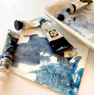 Gina recently renovated her beautiful home. It looks amazing with her updated and relaxing cool color palette of blues and grays. The trouble was, now she had a large empty wall and her old art just didn't match the new vibe. She enlisted my help and we together decided that a soft, abstract piece would blend best. She wanted to use an existing high quality frame that she had, so we decided on a large format watercolor rather then a canvas. 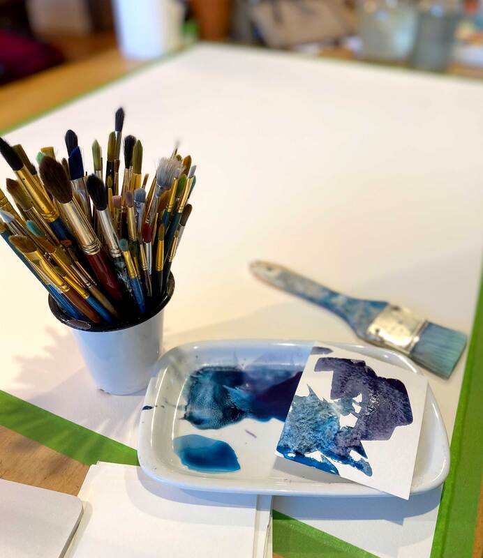 It was a thrill to create the delicate balance of textures, lights, and darks on such a large empty sheet of watercolor paper. 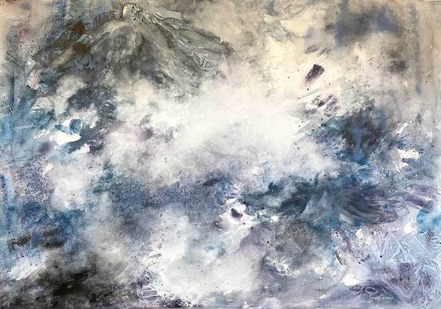 As I worked on this custom piece for her, we talked about how she wanted a little something meaningful added in. Something that she could look at and smile. With that in mind, I tucked in a little dove to remind her family of a special member that had recently passed on to heaven. Can you spot it on the top left corner? 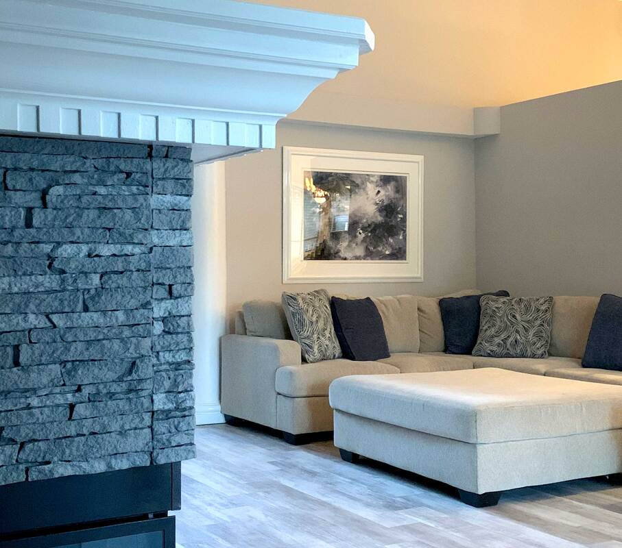 Now she has a piece that suites her taste in the environment she loves to spend time in. If you are remodeling, buying a new home, or simply giving your room a refresh, a custom art piece can marry together the elements of your space. It can also serve to unite your color palette. 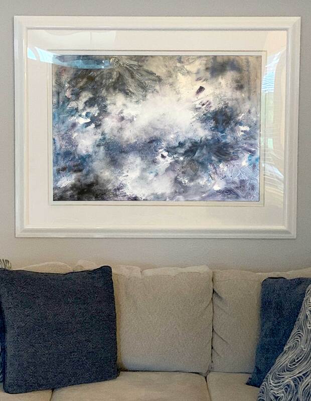 If you've been looking around, but have not found what you want for your wall art, consider having something custom-made. You can send me photos of your wall, your preferred decor style, and your color palette. I'll give you a price on creating a unique piece just for your home.
Contact me if it is time to get something special created to hang in your home.  I remember being in high school watching my friend sign his name and draw a picture with it in everyone's yearbooks. He could whip out the most amazing illustrations before our history teacher even finished attendance! Later in life, my friend recalls that he didn't remember seeing me draw much in high school. Knowing me now, he wondered, why was that? The simple, short answer: self confidence - (or lack thereof.) I loved drawing and art even back then, but I lacked the self confidence in my skills to do it in front of people, or certainly in something as lasting and visible as a yearbook! Watching my daughter, Mia, grow up drawing and illustrating so simply and fearlessly makes me realize how much the old adage, "nurture vs. nature" comes into play. She seems to have a natural talent for it. I sometimes wonder how much of that is growing up taking classes, watching me, and even earning money, teaching her own art classes to kids. It seems to be a mix of both a bent towards drawing, and also just simply, learning how to do it. Just like anything else in life there are tools, techniques, and things to know. Looking back, it's not that I couldn't draw, it's that I always wondered if mine was, "correct" or even if it was good. The idea of drawing in front of anyone terrified me! My parents weren't creatively inclined, so I didn't grow up feeling natural in this element. Even making simple sketches to visually communicate an idea felt like pressure. I simply lacked the toolbox to draw confidently and feel good about it.
I've seen in myself that as my drawing skills improve, so do the finished paintings. Getting the perspective in drawings correct and putting lines down on the paper without worry has been a game changer.   In fact, over the years of teaching watercolor classes, I've had many people tell me that they love to paint, but don't feel confident with their drawings. This resonated with me as I completely could relate. To help with this, I'm putting the paint box aside for a bit and with the help of my wonderful artistic friend, Holli Luther, we are hosting a drawing workshop. This workshop is loaded with tools and practice exercises to build your drawing confidence. Held via Zoom call, it will be a way for your to treat yourself to some comfortable learning at home. It's designed to build your understanding of the technical aspects of drawing, as well as just getting better at translating our 3d world onto 2d paper. I think you'll see that feeling brave in the drawing portion of making art helps to alleviate that "imposter syndrome" and gives you more skills to create courageously. We hope you (or someone you love) can join us on Friday and Saturday, November 20th and 21st. Upcoming Workshop:
Drawing Basics - $90 November 20th and 21st Via Zoom call in the comfort of your home.
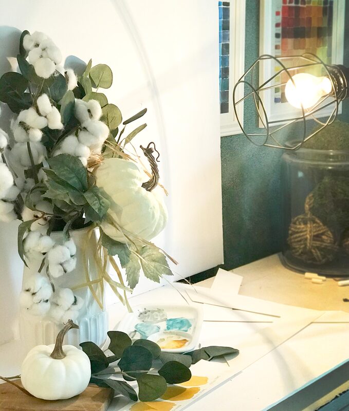
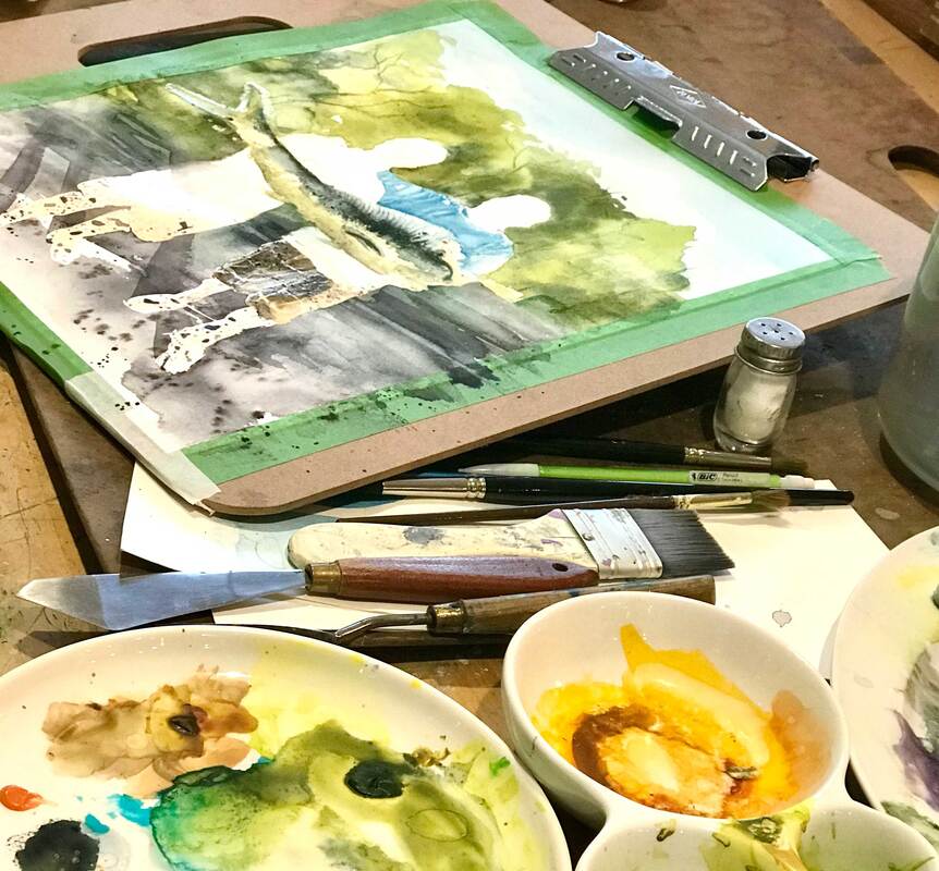
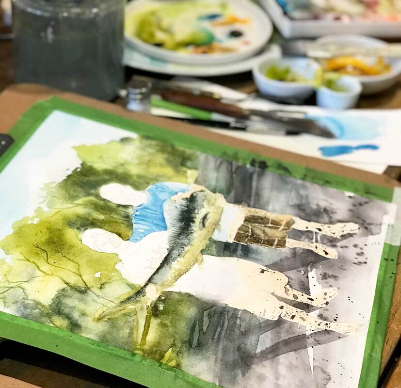
Registration ends November 17th (or until the class is full) *A basic drawing supply list will be e-mailed to participants once sign up is complete. If you are like me, still life paintings hold a certain, soothing calmness. While I love to paint them, they rely heavily on some good compositional skills. An online search can yield so many wonderful suggestions for painting a still life that it can be overwhelming just trying to sort through it all. With this in mind, I compiled a list of the top tips that I find the most useful in working through a little tablescape scene. I'm calling it, "A baker's dozen - 13 tips for creating a still life." 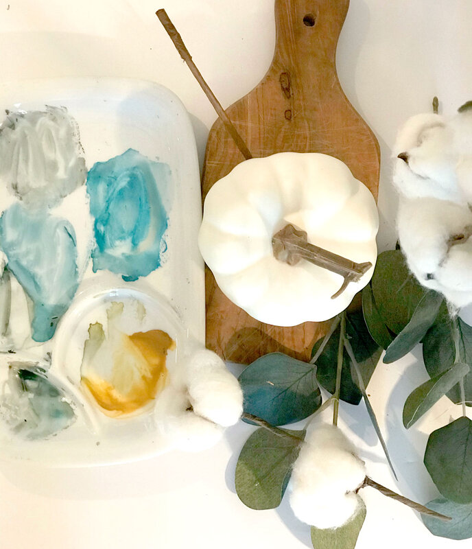 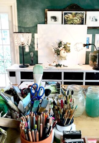 Since part of the fun of painting a still life is the arrangement process of your objects, I'm sharing a photo from my studio space that shows how I set this one up. I keep some foam core board around for shooting images and when I want to work with a white background. I also play around with the positioning of the objects and take several photographs of the still life, which helps me decide the grouping I like best. That leads me to our baker's dozen ...
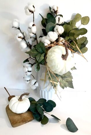
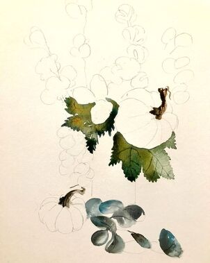
6. Have a Focal Point That's the center of attention that your eye goes to first, the most important element in your design. As Tony Couch (my watercolor hero) says, "Have one and have it be interesting!" A focal point can be achieved with contrast of value, color or size. You can also change the texture at the focal point to bring the eye there. 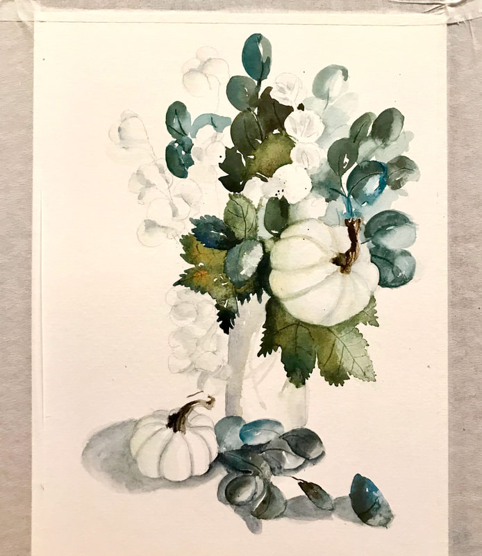 7. Create Balance This does not mean symmetry. It means balancing negative and positive space, lights and darks, etc... so that they eye is comfortable. 8. Establish Movement Move the viewer’s eye around the layout. Movements lead the viewer to your focal point and evokes emotion. It can be accomplished with lines or by repeating colors, values and shapes. In our example, I used the eucalyptus lying on the table to move the eye up to the small pumpkin and the stem of that little pumpkin, moving the eye up to the focal point. 9. Limit your palette to just four colors A limited palette of color allows you to use those colors in each of the elements, even if it is just a touch. That gives your painting a comfortable feeling of continuity. In this example, I used Burnt Umber, Thalo Blue, Quidocridone Gold and Burnt Sienna. 10. Use colors to your advantage One way to do this is by putting warm aggressive colors in the foreground and cool recessive colors in the background or on your background objects. Also, think about strategically putting complimentary colors next to one another in key places. 11. Start lightly By creating a soft under-painting to begin with and gradually layering and building up repeated washes, you can feel more confident as you begin and less worried about making mistakes. The under-painting will serve as a guide. 12. Create a reverse highlight When painting a background, darken the areas slightly around the subject matter to create interest and have your objects jump forward. 13. Remember to make those values pop! To give the utmost force and strength to your work, some parts should be as light as possible and some as dark as possible. 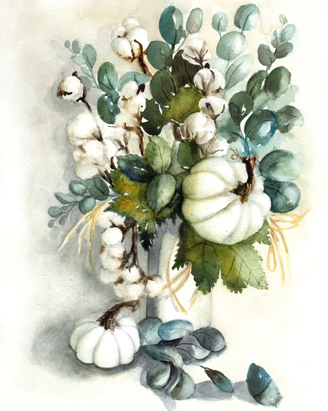 Here is the finished piece. I've been wanting to paint the cotton with white pumpkins for some time, so I'm happy to have finally tackled it in time for fall. I'm going to be selling this and a few other new fall pieces at our local farmer's market in November and a special open house sale that I am hosting at my home November 13th. Learn more and save these dates.
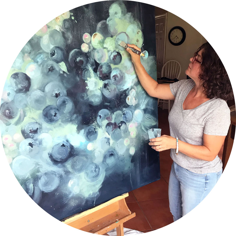
The client showed me swatches of the beautiful mural that she planned to put on the wall across from the piece. She also had picked out the color of paint for the wall that the artwork would rest on. This was very helpful to ensure that the piece would blend and mesh with the office environment. 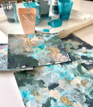 I started my process by experimenting with mixing paint colors and dabbing them on little squares of watercolor paper. I wanted to get an idea of the position of my light and dark values. Also wanted to see if I could mix up those colors and get them to play well together. I made up a little sample palette for myself to work from and set aside some time to just play with colors. This proved to be very fruitful for me. Experimenting on small paper first helped me to not feel overwhelmed when tackling a very large canvas.  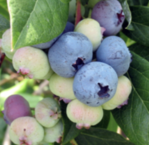 After mixing up larger amounts of color, I started by building up the dark background and then gradually layering in the mid tones. Since circular shapes communicate happy to me, I decided to incorporate different shapes of varying sized circles. As I layered them on, a couple of them looked like blueberries to me. I love blueberries as they ripen because of the way they bloom into soft pinks and greens. Things were beginning to come together visually. I kept building and layering in blueberries at different stages of ripening. 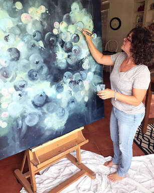 This challenge of making an abstract painting that communicates joy was thrilling. While abstract pieces do not attempt to represent reality, they do utilize shapes, hues and lines to communicate emotions. I enjoy stepping out of my normal painting style and exploring large format pieces for grand walls that are both colorful and lively. It's invigorating to mix a little bit or realism with abstract splashes of light and textures. 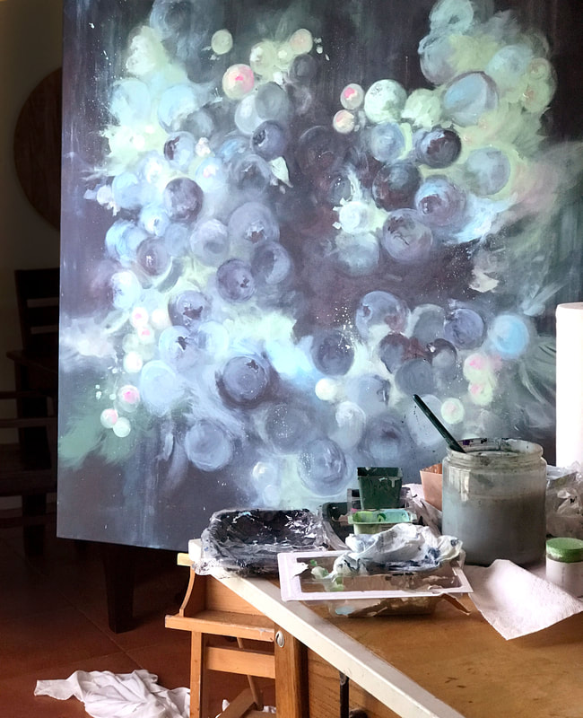 Once I had the painting mostly finished, I left it up on the easel for a couple of days to look at. I often build in this window of time just to walk by and see if there are any lingering issues bothering me about a piece. Often times I see things that I'd like to correct. This time also allows me to look at the piece in different lighting with fresh, rested morning eyes. 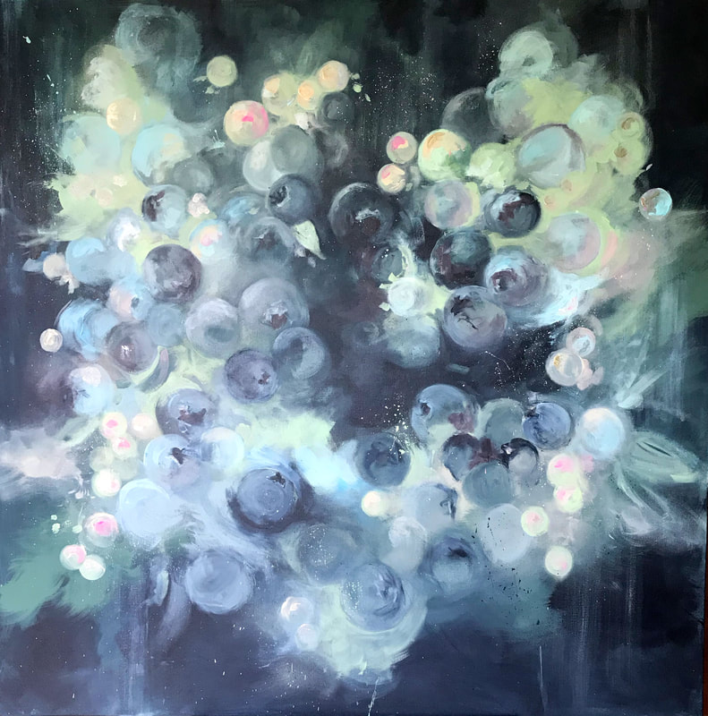 If you have a blank space and are craving some special art to pull your room's color palette together, feel free to reach out. This was a very large 4 x 4' piece that filled the client's wall perfectly. Whatever your room size, I'm pretty sure I can get my hands on a canvas that will work beautifully. E-mail me here to inquire about pricing.
|
Caryn DahmWhether I am painting custom artwork, creating a water colored logo for a client, or teaching art students, I hope to refresh and inspire others with my work. Read more ... 
Archives
October 2023
Categories
All
|

 RSS Feed