
|
This week's virtual
|
Step OneRead the teaching to your right about creating focal points in general. It is an important part of composition that when missed, detracts greatly from a piece.
|
A focal point is the center of attention that your eye goes to when you first look at something. It is not as important that your focal point is amazing or complicated, just that you have one and that it is more interesting then the rest of the piece.
When you have a focal point in your painting it helps to lead your eye around the page and adds emphasis or dominance to the place of the most interest. You can create a focal point by adding the following where you want the viewer’s eye to land:
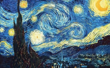
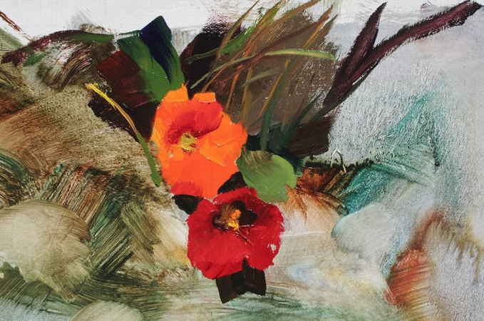
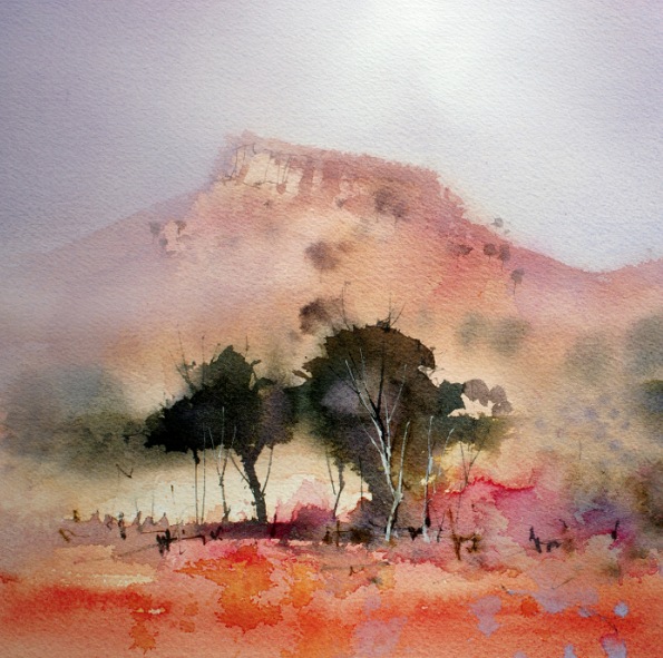
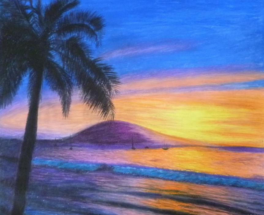
For the purposes of our class we are going to create focal points using colors. As we know the best way to create focal point with color is to put complimentary colors side by side into a scene. See below for some examples of color creating focal point. |
Step TwoInvestigate
Step ThreeView some examples
|
Look at what you see around you. Is there something in your yard or house that has a focal point made by colors? Do you have any little scenes set up in your home as a display or stored colorful items? Are there interesting plants outside that may be displaying complimentary colors? If so, take note at how these things happen naturally. Often times we create focal points in our decorating without really knowing it.
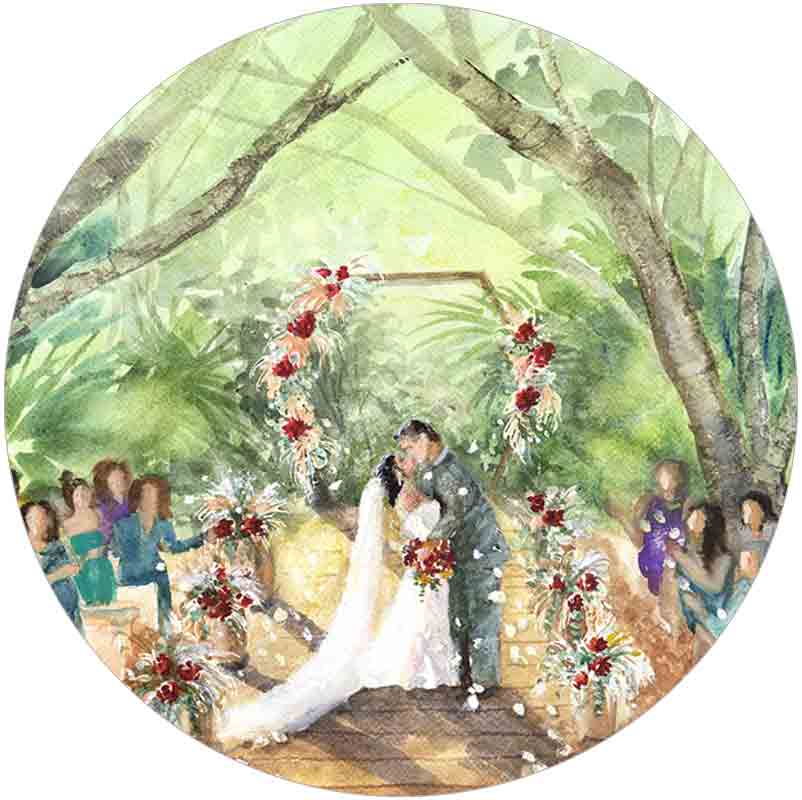
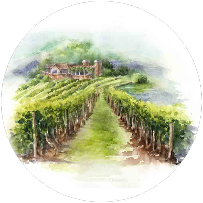
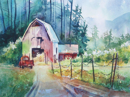
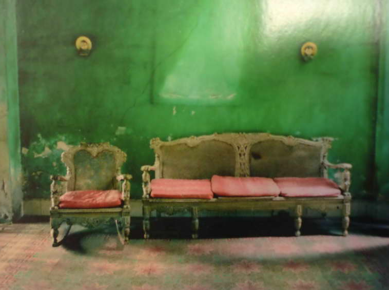
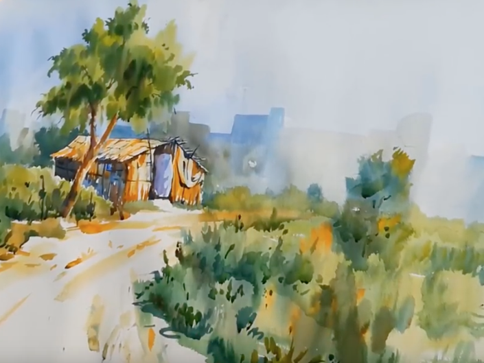
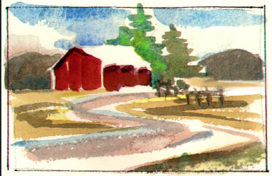
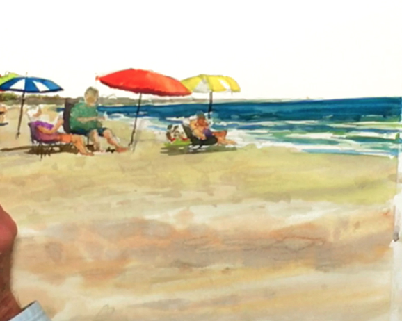
Look at the photo gallery below. Identify where the focal point is and notice how the complimentary colors are creating that focal point. |
Step FourIt's time to start our project
|
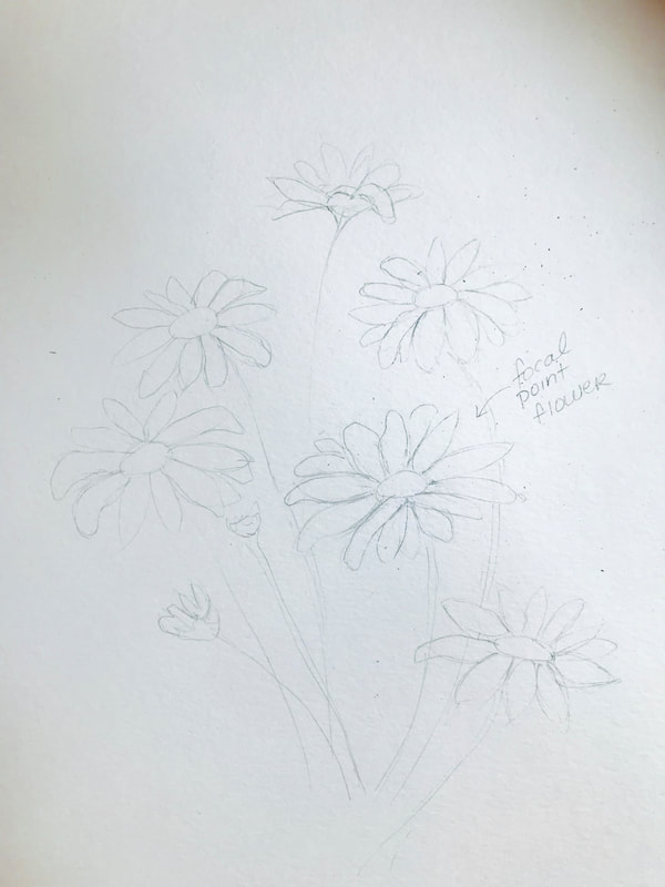
First draw the daisies on to your page. Try to include an odd number, at least 5.
Make sure that the daisies are odd in shape and size. They should be viewed at an angle as if you are walking up to a field of them (not straight on to the viewer) Hint: none of the circles in the center should be perfect circles, more of an ellipse (oval) shape. Consider making some of the flowers a bud or small and just beginning to open. The petals should be mismatched and some may droop a little. The important thing is that they are varied and not uniformed. One of the flowers should be deemed as your focal point flower. This one will use complimentary colors to the fullest extent. The stems can extend behind some of the petals. Using a flat brush, wet the background with water going carefully around the petals.
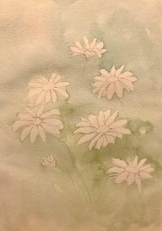
Next paint into it using a very wet light wash of your favorite blue and yellow mix. I used quinocridone gold mixed with manganese blue to make a bluey green. Ultramarine blue and Cadmium yellow works too. Look at your mix chart as a reference : ) It is fine if it is uneven and/or blotchy. The important thing is that it is a very light, wet mix. The darkest colors should be in and around the flowers. Test it first on your scrap paper and ad more water if needed. |
|
|
Now let's leave the background alone to dry.
Paint the centers of the flowers using Cadmium yellow. Touch into it around the bottom of the centers using Burnt Sienna. |
|
|
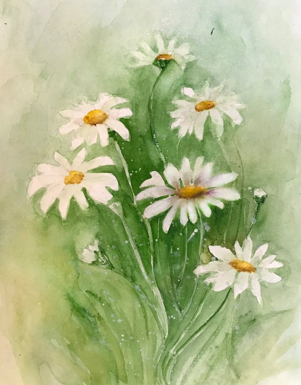
Using a wet brush loaded with pigment, carefully work your way around the flower petals. Each petal is defined by the color around it.
After you have a chunk of color down, use a wet brush to blend out the edges. Be careful not to let hard dark edges dry as they will be difficult to blend out. Work in small areas at a time so that this doesn't happen. While you have the pigment wet, scratch into it with the palette knife to create stems. |
|
|
Once it is dry, go back in and darken up the areas around the focal point. This will make it the section with the most contrast - which is another way to create focal point. Be sure to use clean water to diffuse it out and spread it around into the other areas. You want the background to fade out into a pale color.
|
|
|
Here is the part where the complimentary colors come in. Go around the petals of your focal point flower with a pale purple-gray color, I got mine by mixing ultramarine blue with alizarin crimson and payne's gray. Start at the center and dab a little bit of color. Using a clean brush, pull the color out to the edges. The most color should be around the inner center. You can even use a bit of your purple gray or more burnt sienna to darken a bit around the yellow center. I had a not-so-happy accident and then overworked my focal flower's center a bit, but I liked it prior to that point. : )
Now using a very pale green and use it to do the same thing to the other flowers. Just giving the other petals a little bit of dimension. |
|
A few final tips...
|