|
This week's virtual
|
Step OneRead the basic definitions of color terminology so you can talk like a pro : )
|
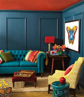 Example of complimentary colors used in a room Example of complimentary colors used in a room
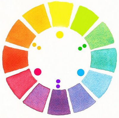
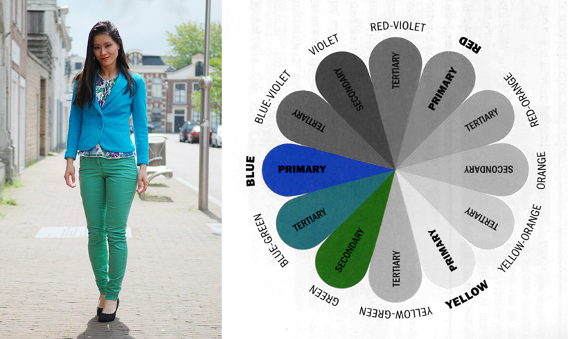
The Munsell color wheel is not just a pretty thing to look at, it actually has great functionality in understanding what colors to put together when. Below are some vocabulary terms you should become familiar with to gain a better understanding of how to use a color wheel.
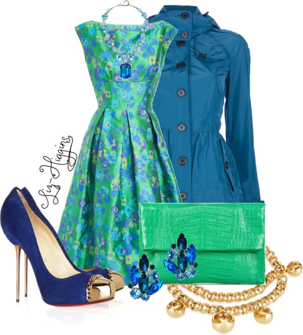
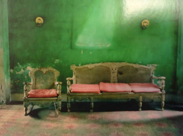
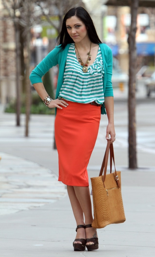
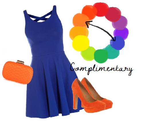
Color vocabulary words • Primary colors – red, yellow and blue. These are the colors from which all others are mixed • Secondary colors – Made by mixing together two primary colors. • Tertiary colors (Intermediate colors) – A primary and a secondary mixed together. • Complementary colors - Contrasts most strongly with the color opposite on the wheel. Areas of complementary color that are fully saturated and placed next to one another tend to vibrate and create tension. For this reason, the most effective use of a complementary color is to let one dominate by giving it a bigger area or fuller saturation, while using the other as an accent. Putting these side by side grabs the eye and creates a focal point. 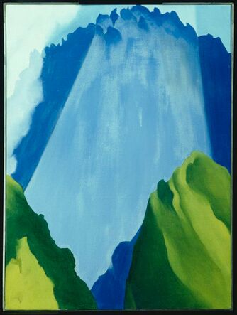 Example of analogous colors in art. Example of analogous colors in art.
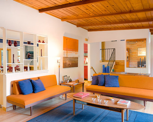
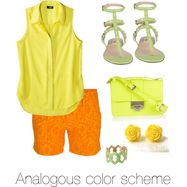
• Analogous colors - Side by side colors on the wheel. These look the most harmonious together. To create a calming look in your paintings, select neighboring colors for your color palette.
• Hue – another word for color • Tint – the addition of white to any color to create a new color • Shade – the addition of black to any color to create a new color • Value or Brightness – darkness to lightness of a single hue • Chroma- saturation or brilliance of a color (how dull or sharp it is) • Monochromatic – a color scheme that uses a single hue with variations in Chroma and Value only. • Achromatic-A colorless scheme using blacks whites and grays only ( we won't use this much but it is worth knowing) 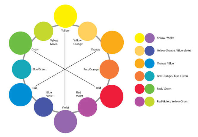
|
Step Two
Test yourself
|
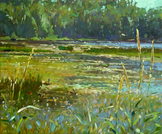
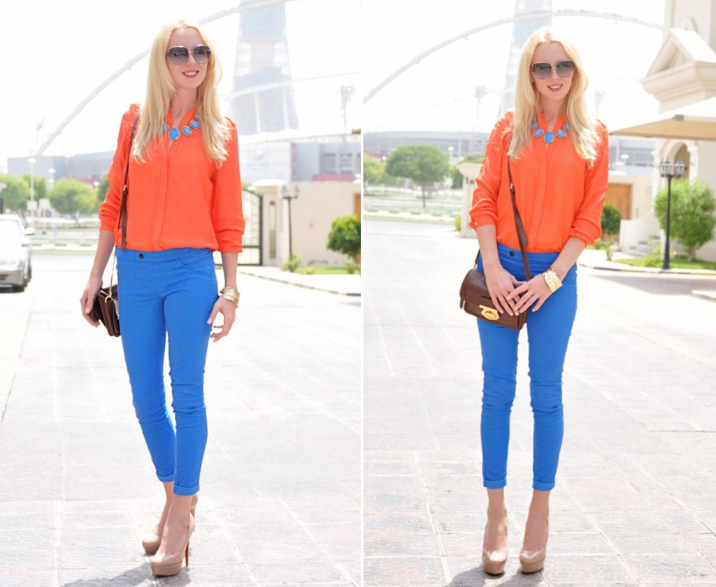
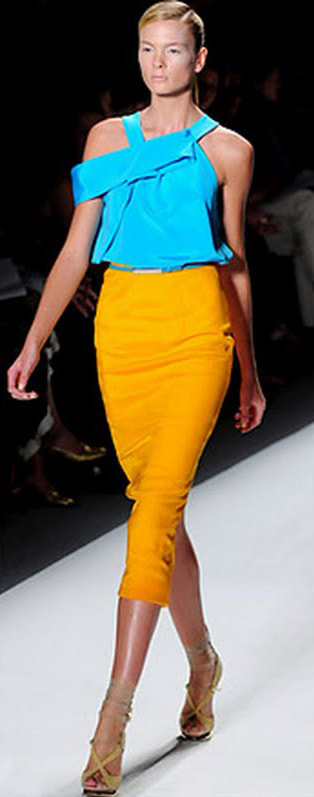
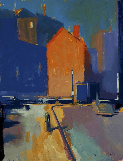
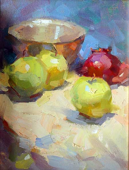
Look at the photo gallery below. Try to identify which color schemes are in the picture. Are they complimentary or analogous color schemes? You may have to click on them to see the entire image.
|


Step Three
It's time to start our project
Start with an 11x11" piece of watercolor paper. This size isn't particularly important. I just want you to be able to keep it in your art notebook.
Wet the paper and tape it down. (called stretching the paper)
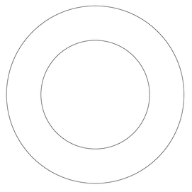
Using a circle template, or a small bowl inside of a plate, draw 2 concentric circle. Try to make sure that the inner circle is centered within the larger outside circle.
Wet the paper and tape it down. (called stretching the paper)
Using a circle template, or a small bowl inside of a plate, draw 2 concentric circle. Try to make sure that the inner circle is centered within the larger outside circle.
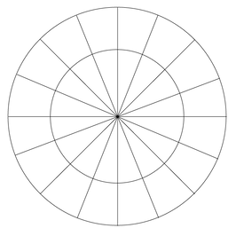
Now using a ruler. Divide the circle into 16 pie shaped pieces. Yes this will take a little time to get it correct. I think it's helpful to start by drawing a vertical line and then the horizontal line crossing through it first. Then divide up those sections further.
Tip: draw the lines lightly so that they can be erased in the next step.
Tip: draw the lines lightly so that they can be erased in the next step.

Now erase your extra lines that are inside the inner circle. You will be left with little sections around the outer edge to put your paint in. Like your own little paint palette.

Using a pencil, label your paint colors around the circle in this order. You may not have all of the colors. That is fine, just substitute the ones that you don't have with colors that are similar. If you don't have something similar, combine the colors on either side of the missing color to create a new color and name it whatever you'd like (magical magenta, grosser green ... you get the idea. Be creative.)
Get a nice puddle of each color activated that you can almost pour it off of your palette. You don't want to work too dry.
You'll see there are places that I want you to mix 2 colors. There is no set ratio here. Just try to create an even 50/50 mix and modify it if you don't like how it turned out. Remember to test the colors first on your scrap paper.
A few final tips...
- If you really struggle with geometry and don't want to try to create the color wheel. You can download this template I created and print it on card stock. It won't hold up as well as the watercolor paper but it will get the job done.
- This is an exercise to not only learn about color, but to get you used to the amount of paint and water to use. Try to make nice even washes of color in each section.
- Erase your extra pencil lines if you want or leave them... up to you.
- Experiment with using a flat or a round brush and see what you like better. Since these sections have both straight areas and curved outer parts see what feels best to you and makes the cleanest washes.