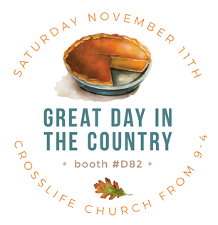
New Series I've been working on a new series called, Restlessness. It is about ways that I enjoy resting when I find myself moving too fast and not slowing down to take a hot bath, catch my breath outside or sip some tea with honey! From gardening to reading to running a 5K ... I'd love it if some of you e-mailed me with your favorite ways to recharge and refresh. A Very Special Project  Presenting the illustrated Oviedo map to the mayor and city counsel. Presenting the illustrated Oviedo map to the mayor and city counsel. For about a year now, I've been honored to work along side of our Oviedo Art Board to bring you an illustrated map of Oviedo! With so many wonderful parks, businesses and establishments it was challenging to narrow down the icons of special places to include! We tried our best to not overwhelm the map by adding too much, but still representing those locations near and dear to our hearts both historically and in the present. I hope the residents have fun spotting all of their favorite locations in our city! In addition to being hung in city hall, the Oviedo plans to use it on postcards and other merchandise and put the money back into the art board fund. Our hope is that it will be for sale soon in the administration building and also at Great Day In The Country this November 9th! Live Painting As some of you may know, I've been finding myself painting at a whole lot of weddings lately. It has been so special to be present for a families biggest day of celebration! Some of the weddings that I painted at have been nominated for Wedding Venue Map's new award, "The Mappies" I would love for you to take a look at some of these incredible weddings for inspiration and also to throw a vote my way if you are so inclined : ) Thanks so much for your support all of these years as I am always exploring ways to earn a living as a local artist! Voting links are below: https://mappys.weddingvenuemap.com/home/entry/96 https://mappys.weddingvenuemap.com/home/entry/94 Open Studio in AugustLastly, our weekly open studio classes kick back up from 6pm to 8pm on Thursday, August 15th. You can register or simply learn more about about them here: Open Studio and Classes
Happy fall! I've been meaning to get this blog post out to you, but life has been full of car troubles, kids, work projects and home repairs! A month can sometimes feel like a year, but then we look back and it's flown by all at the same time! I hope you'll take a minute to enjoy a new painting that I'm happily finished with. This one has been swirling in my head for years! Our First Church of Oviedo has faithfully hosted one of my favorite pumpkin patches for as long as I can remember and it's a favorite of mine. Even on the few years I haven't purchased from them, it's been so fun to drive by and see. Once those string lights start going up, it feels like it's officially fall. I love to see it when I'm dropping off or picking up at the nearby high school, especially after a football game! 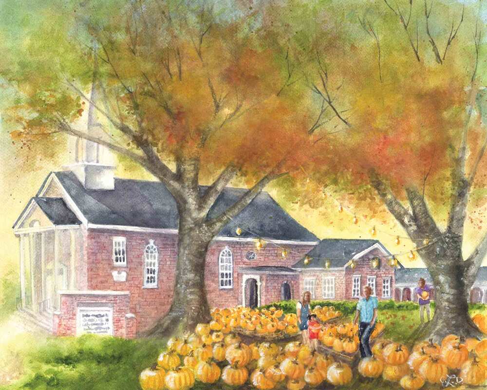 Since this scene feels so iconic for Oviedo, I've decided to include it in the Oviedo art card pack. It is nestled among some of my favorite pieces such as; The Farmer's Market, Tutus on Broadway, The Old Townhouse, The Lawton House at Christmas Time and of course, Pappy's Patch just to name a few. 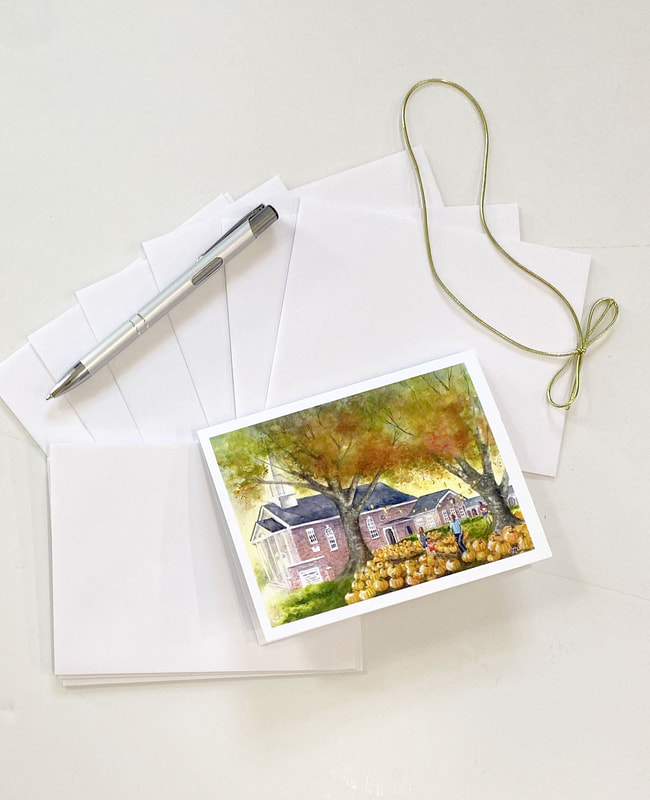 While over the years, this pack of cards has evolved and some pieces have been taken out (bye-bye old fire station : ) I'm happy to say that this year it boasts 12 paintings of Oviedo scenes! 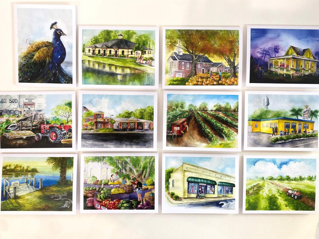 I have other scenes that I've painted around town over the years such as Oviedo On The Park, roosters and the old downtown, but these 12 just rise to the top for me. 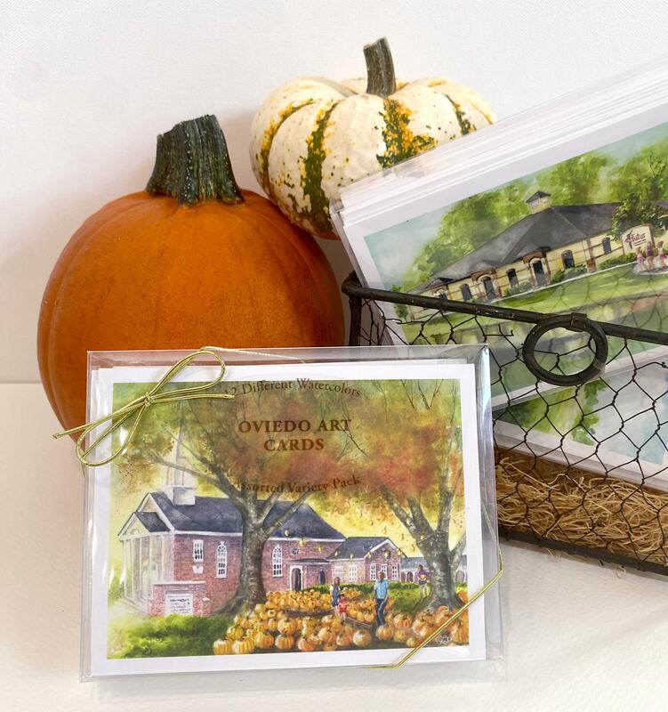 ,If you'd like to pick up the 12 pack with envelopes for a gift, or a matted 8x10" print of the Perpetual Patch painting they are happily being sold at Riley Reigh Mod Market. If you haven't stopped in there, you simply must... the shop is bursting with holiday gift giving goodies!
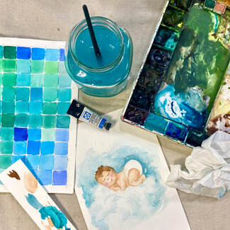 Hello friends. I hope everyone has thoroughly enjoyed this jam-packed summer that seems to have gone by waayy too fast! I did not paint as much as I had hoped, but I did soak in lots of time with friends and family. In fact, this week my project was inspired by those who are either pregnant or expecting new grand-babies! So much fun to anticipate and celebrate these new little lives. After drawing and painting this cuddly cutie, I put him into the new card design below. 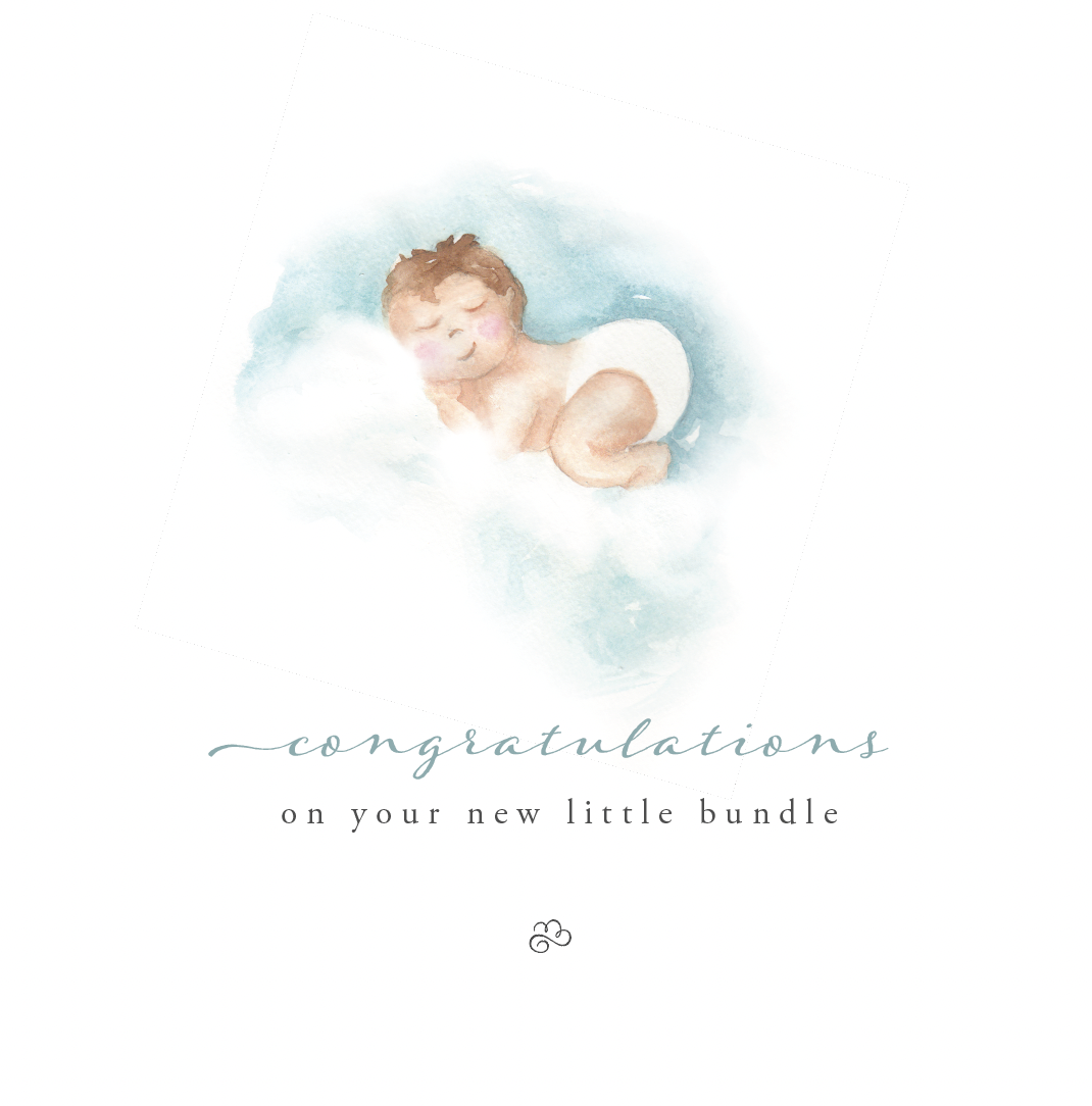 I often have people asking me how I digitize my art and get it printed. Well, my secret is that my background is actually in graphic design (I have a visual communication degree from The Ohio State University.) I love to marry the two disciplines of art and design in my work where applicable. Having a graphic design background has given me the know-how to scan the watercolors, clean them up and put my art in all kinds of printable formats. It has also made it so much easier for me to market my art as well. Since this is something that I've been asked so much about, I've decided that in these upcoming open studio classes, I will share my best tips and tricks for digitizing my art. Each Thursday, I will demonstrate a short painting technique as well as a practical bit of teaching and advice about getting your work printed. 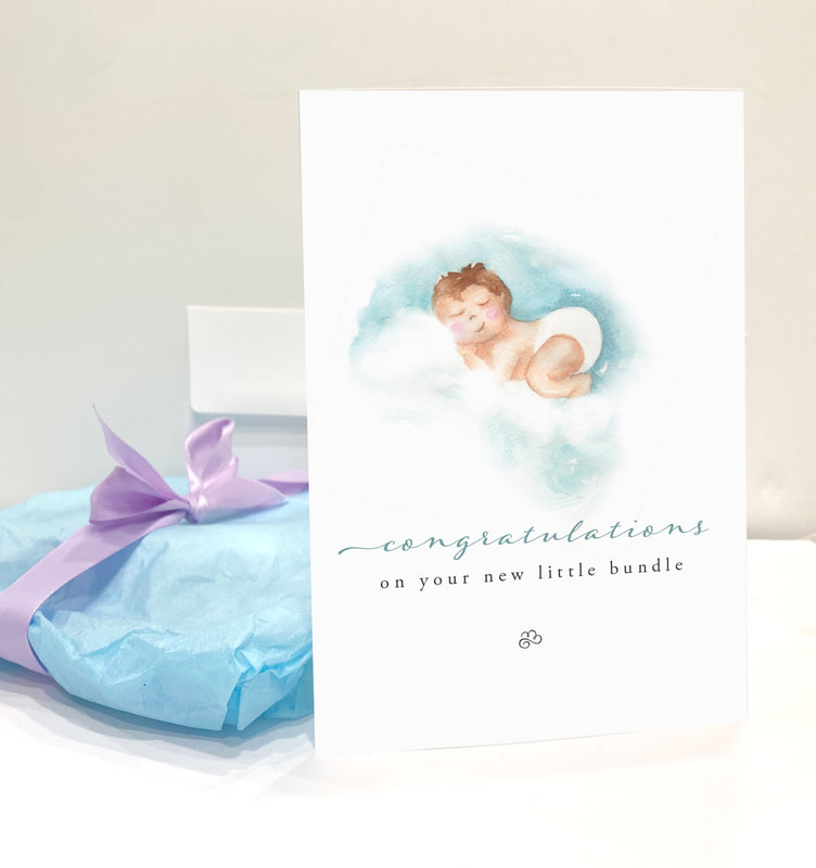 If you are interested in making and creating art and designs, then come to A Create Place in Oviedo on Thursday evenings! August 17th we'll be starting back up and sharing some hot tea, tips, techniques and of course just the joy of creating in community! Sign up or simply learn more about the cost and details here. Psst ... I'll have this design ready in local shops soon and for sale in my studio. Call or e-mail with questions: [email protected] 407-421-3198
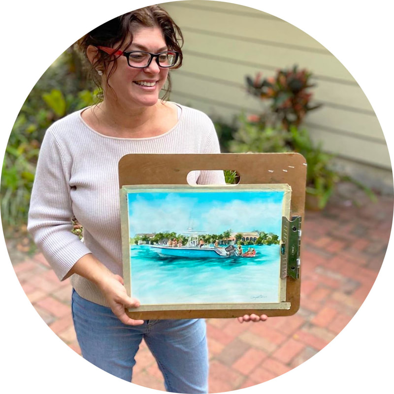
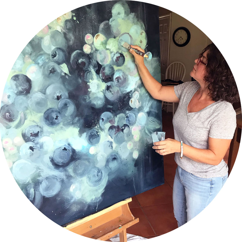
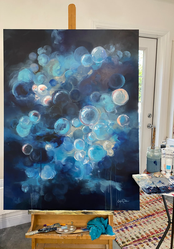
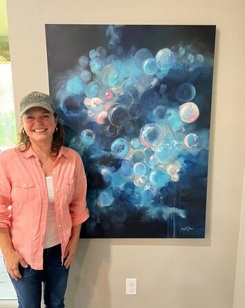
This week I had the pleasure of working on one of my favorite types of projects ... a large format custom canvas!  It brings me such joy because I have felt the frustration of having an empty space but not being able to find the right piece of art for it. Many of us have a wall in our home that is begging for something special to hang on it... something that pulls your color palette together. I have the ability to create abstract paintings that are all about the specific mood and colors you want to convey. I find it particularly interesting that this savvy client wanted something round, curvy, bubbly and full of motion and layers. I was just reading how this is going to be a strong theme for 2022 in terms of design trends. Check out this quote from Adobe's website calling these sort of shapes, "Soft Pop."
If this sort of thing interests you, you can read more about Adobe's predicted upcoming design trends here. 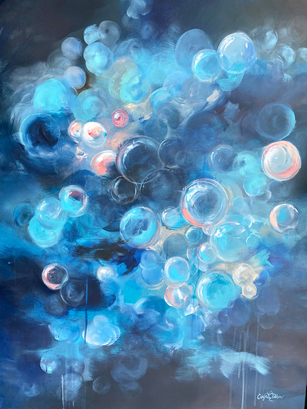 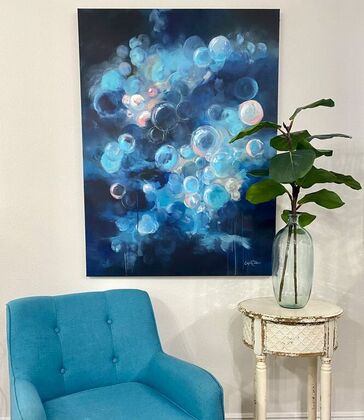
So how does this work? If you are local, we can schedule a home visit for me to see your colors. However, if you live out of town, you can send me photos of your wall, your decor style and your color palette. I'll give you a price on creating a unique piece just for your home. Contact me if you have questions about this process, or simply if you have a space needing some Creative Collaboration ; )
 I'm currently working on a series of little paintings entitled, "restless". It's an exploration of the ways that people like choose to deliberately slow down, refresh and recharge.
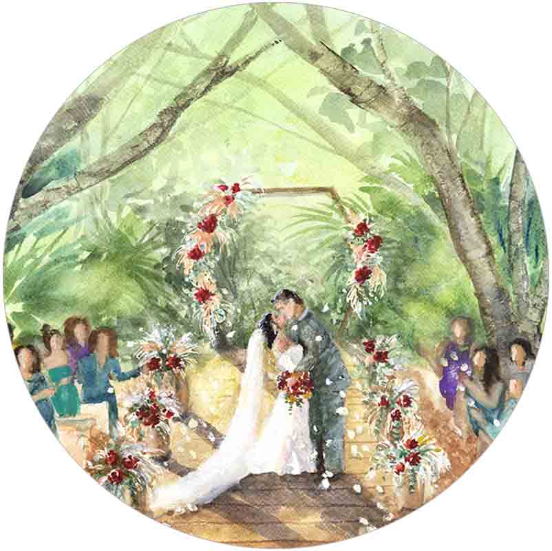
 You may recall that I have an oyster piece that I painted many moons ago. This new oyster grouping is freshly shucked! I love the interplay of the warms with the cool purply blues. Things like this make great special touches for party invitations, kitchen decor, or menus.   Upcoming Workshop and Weekly Open Studio I'll be leading a Nautilus shell workshop in September at Leu Gardens. Stand by for this new date as I'll be announcing it soon. On Thursday, August 15th we'll be starting back up with our weekly gatherings. I love this time slot, so I'm sticking with Thursday evenings from 6pm to 8pm. You'll get a short art lesson and watercolor project from me and then will be free to work on whatever project of yours needs working on. I promise it doesn't just have to be watercolors : ). The class does fill up as I can only take 12 maximum. A Very Special Project  Presenting the City of Oviedo illustrated map to our Mayor and City Counsel Presenting the City of Oviedo illustrated map to our Mayor and City Counsel For about a year I've had the honor of working along side our Oviedo Art Board to bring you an illustrated map of Oviedo! We had so many places that we wanted to include that it was hard to decide. In the end, we truly hope that the residents enjoy it and have fun finding all of their favorite locations in our city on the map! In addition to being hung in city hall, the city plans to print it on postcards and other merchandise to sell and further bring more artistic elements to our town. You'll hopefully be able to purchase it from the city soon as well as at Great Day In The Country This Fall! Wedding Contest  Caryn Dahm live painting a wedding scene at Bella Cosa in Lake Wales, FL Caryn Dahm live painting a wedding scene at Bella Cosa in Lake Wales, FL I'm often found "live painting" at weddings these days. It's such a joy to be a part of people's big day! Two of the weddings that I have painted at have been nominated for a "Mappy's" award. It is awarded based on the best overall wedding and team of vendors. If you want some wedding inspiration, you'll find tons at the wedding venue map website. I'd love it if you'd be willing to vote for one of these weddings that I painted at:
https://mappys.weddingvenuemap.com/home/entry/94 https://mappys.weddingvenuemap.com/home/entry/96 Many blessings to you as you enjoy the rest of your summer! - Caryn |
Caryn DahmWhether I am painting custom artwork, creating a water colored logo for a client, or teaching art students, I hope to refresh and inspire others with my work. Read more ... 
Archives
October 2023
Categories
All
|


 RSS Feed