|
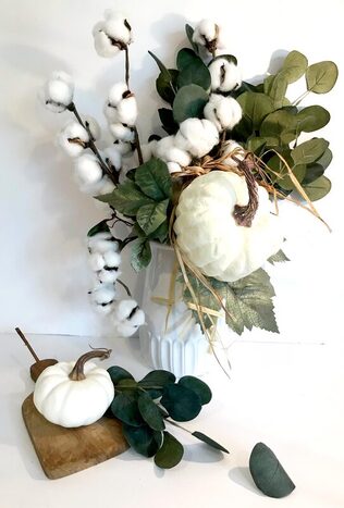
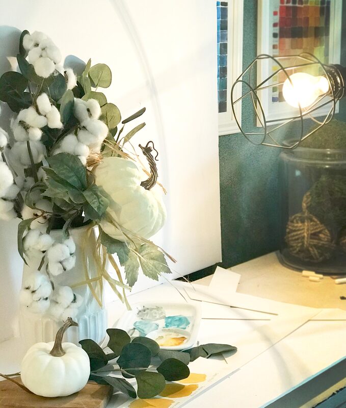
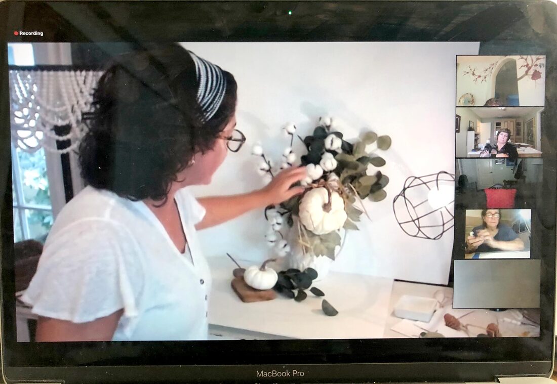
If you are like me, still life paintings hold a certain, soothing calmness. While I love to paint them, they rely heavily on some good compositional skills. An online search can yield so many wonderful suggestions for painting a still life that it can be overwhelming just trying to sort through it all. With this in mind, I compiled a list of the top tips that I find the most useful in working through a little tablescape scene. I'm calling it, "A baker's dozen - 13 tips for creating a still life." 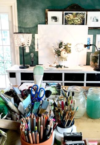 Since part of the fun of painting a still life is the arrangement process of your objects, I'm sharing a photo from my studio space that shows how I set this one up. I keep some foam core board around for shooting images and when I want to work with a white background. I also play around with the positioning of the objects and take several photographs of the still life, which helps me decide the grouping I like best. That leads me to our baker's dozen ...
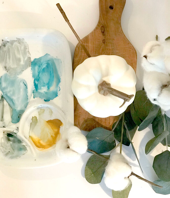
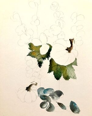
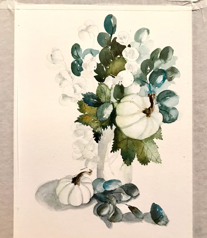
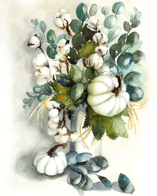
6. Have a Focal Point That's the center of attention that your eye goes to first, the most important element in your design. As Tony Couch (my watercolor hero) says, "Have one and have it be interesting!" A focal point can be achieved with contrast of value, color or size. You can also change the texture at the focal point to bring the eye there. 7. Create Balance This does not mean symmetry. It means balancing negative and positive space, lights and darks, etc... so that they eye is comfortable. 8. Establish Movement Move the viewer’s eye around the layout. Movements lead the viewer to your focal point and evokes emotion. It can be accomplished with lines or by repeating colors, values and shapes. In our example, I used the eucalyptus lying on the table to move the eye up to the small pumpkin and the stem of that little pumpkin, moving the eye up to the focal point. 9. Limit your palette to just four colors A limited palette of color allows you to use those colors in each of the elements, even if it is just a touch. That gives your painting a comfortable feeling of continuity. In this example, I used Burnt Umber, Thalo Blue, Quidocridone Gold and Burnt Sienna. 10. Use colors to your advantage One way to do this is by putting warm aggressive colors in the foreground and cool recessive colors in the background or on your background objects. Also, think about strategically putting complimentary colors next to one another in key places. 11. Start lightly By creating a soft under-painting to begin with and gradually layering and building up repeated washes, you can feel more confident as you begin and less worried about making mistakes. The under-painting will serve as a guide. 12. Create a reverse highlight When painting a background, darken the areas slightly around the subject matter to create interest and have your objects jump forward. 13. Remember to make those values pop! To give the utmost force and strength to your work, some parts should be as light as possible and some as dark as possible. Here is the finished piece. I've been wanting to paint the cotton with white pumpkins for some time, so I'm happy to have finally tackled it in time for fall. I'm going to be selling this and a few other new fall pieces at our local farmer's market in November and a special open house sale that I am hosting at my home November 13th. Learn more and save these dates.
|
Caryn DahmWhether I am painting custom artwork, creating a water colored logo for a client, or teaching art students, I hope to refresh and inspire others with my work. Read more ... Archives
October 2023
Categories
All
|



 RSS Feed

