|
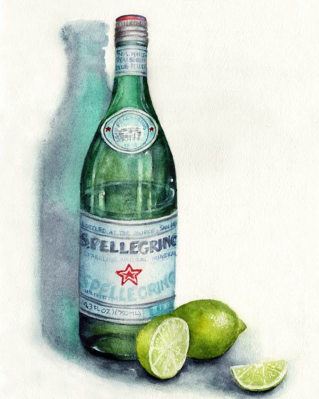
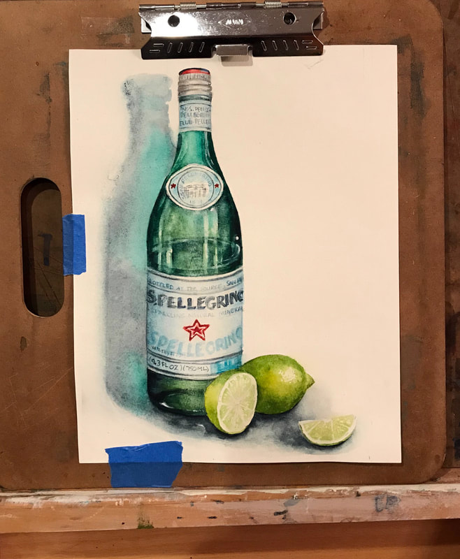
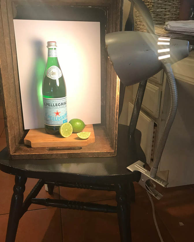
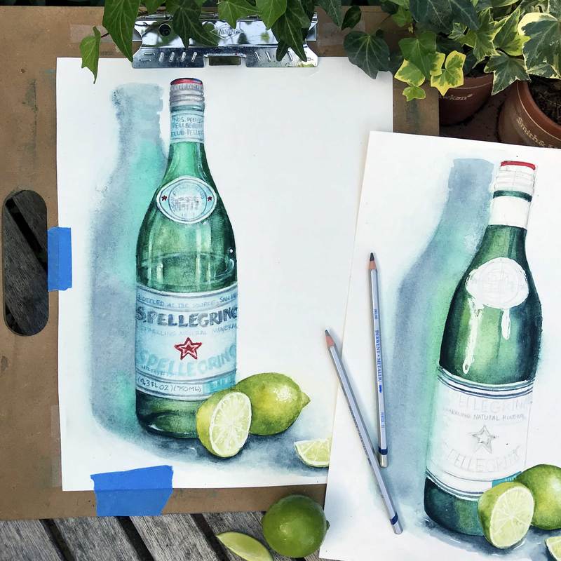
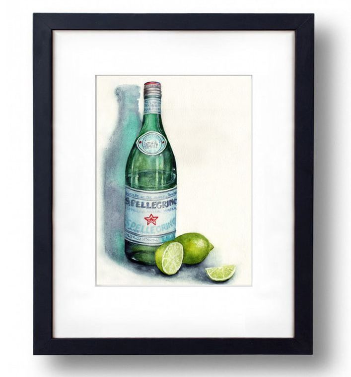
I enjoy drinking sparkling water, but something about San Pellegrino is my favorite! I think the bottle and label are what sells me. I've always been a sucker for good packaging. As a teenager, I used to hoard green glass bottles. I had a collection of it on my window sill for the light to shine through. When my husband and I visited Italy this year, I thought I was in heaven. At every restaurant we dined in they asked if you wanted your water "still" or "frizzante." I of course would always opt for the crisp fizz. Most of the time I was served my favorite brand with a tall glass to pour it in. 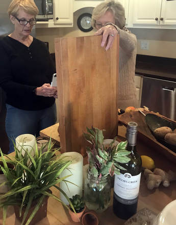 So last week, when my art students and I worked on studying how to compose a still life, I selfishly set myself up a scene of limes and San Pellegrino. By putting the subject in a box and shining a focussed light on it, you cut down on surrounding ambient light and get nice clean highlights and shadows. I used a white background because I wanted that gorgeous green glow to show up behind the glass. The clip on light was picked up at a garage sale years ago, and it has proven to be a great asset. My first attempt was a bit of a disaster. I couldn't wait to get to the painting part so I rushed my drawing. The first bottle on the right was far from symmetrical. Not only that, but my paper was shredding along the edge of it from the water. I decided it was time to cut my losses and start again. Typically my second pass at a painting is better. I try to learn from my mistakes the first go around. So happy to finally have painted a scene that reminds me of our trip to Italy, and a beverage I love.
|
Caryn DahmWhether I am painting custom artwork, creating a water colored logo for a client, or teaching art students, I hope to refresh and inspire others with my work. Read more ... Archives
October 2023
Categories
All
|


 RSS Feed
